
Jeff Green | Apr 14, 2021
One of the first things that South Frontenac Township Chief Administrative Officer Neil Carbone talked about when he took on his new role was the need for new branding in the township
“The practise of branding itself is not just about a logo. Your brand is who you are. The act of branding a place is not about creating something new, it is about making sure that everybody sees themselves in the community,” he said, in an interview with the Frontenac News in January of 2020.
While there have been a lot of unexpected disruptions in the township since early last year, the branding development process has been proceeding.
A steering group was struck, and a community survey was released, asking residents to share their thoughts on what makes South Frontenac means to its residents, in order to get a sense of how the community saw itself. The Township received nearly 400 responses to the survey.
1dea Design + Media Inc is the company that was hired to work through the process and come up with an suitable design for the logo and the brand.
The feedback that they worked with gave them a set of parameters to work with
Their intention was to produce a brand logo that would appear strong alongside the Frontenac County brand, would emphasise “South” in order to differentiate the township from the other Frontenac. The brand needed to be easily understood, vivid but with natural colours, have stand alone graphics, be modern “progressive, unique and a bit bold, and be easy to use for variety of applications. And it was decided that the word “township” was unnecessary.

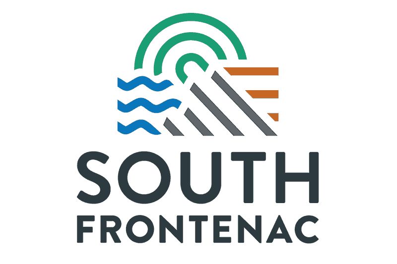
The logo they came up with has 4 elements. The blue waves on the left represent water, the grey diagonal lines in the bottom middle represent the Canadian Shield, the horisonal brown line on the right represent the land (farmland) and the circular lines in the top middle represent the communities that make up the township. The 4 elements in the logo also correspond to the 4 founding townships (Storrington, Loughborough, Portland and Bedford) that make up South Frontenac.
In the wordmark, the 5 letter word SOUTH is scaled to the same width as the 9 letter word FRONTENAC.
While the logo and wordmark will become ubiquitous over time, the “rationale” for the brand and logo is a more esoteric statement.
It reads: “There are the blue waves of lake-life, the furrows found in our rural areas, and the overarching energy of lush, green nature; our environment brings us together. Amongst all this, lies the Great Canadian Shield, protruding powerfully and part of our heritage. South Frontenac is the one place where you find three polarizing landscape working symbolically together, weaving and seaming into one. The logo reflects this perfect balance and the symmetry of these elements coming together. South Frontenac’s many communities are connected in much the same way as our diverse landscapes, brought together by a common sense of resiliency, adventure and a humble way of life. These communities (represented by the three circle) thread into the other elements as an ever present part of the past and future of South Frontenac.”
The brand a logo are being presented for consideration the South Frontenac Committee of the Whole this week, with a view towards being adopted by Council at their April 22 meeting.
If all goes according to plan, implementation will be begin to take place within a couple of months.
More Stories
- Global Gardening
- No Winner Yet in Catch The Ace But Fundraising Target Met
- South Frontenac Food Bank Opens Second Location in Battersea
- Sharbot Lake Pentecostal Church Anniversary - 1925-2025
- Frontenac Holistic Health Fair - September 20 At Storrington Centre
- Odd Year For Real Estate - But Sales Are Steady Year Over Year
- 193rd Kingston Fall Fair
- Kim Phuc - the Napalm Girl - To Visit Flinton In November
- South Frontenac Council - September 2
- Sticker Shock - EV Charging Station To Cost North Frontenac Township
