
Jeff Green | Jan 23, 2019
When Avenue Strategy and Backcountry Branding presented a new look for the Frontenac County brand three years ago, the council of the day was skeptical. The new crest appeared empty. It had just a few lines of colour, stylized fir trees and maple leaf.
Kathleen Volebregt from Avenue Strategy talked about the story of Frontenac County that she had gleaned from interviews, and Jon Allison from Backcountry Branding explained how the shapes and colour encapsulated that story in a stylized manner. The politicians were skeptical about the emptiness of the image and there were even suggestions that new elements should be added to the crest.
Allison explained that the brand would be filled out over time by the way it would become associated with the image that the users of the brand attached content to it over time. He also explained that the entire package was a complete. Council had the nominal option to accept or reject the brand, although unbeknownst to the council members material had already been fitted out with the new branding, including a decaled Smart Car that was parked just metres away in the parking lot of the county offices.
Somewhat reluctantly, Council accepted the brand.
Since then, the brand has indeed been filled out, and has altered the identity of the township and been embraced by the business community. When it was time to re-brand the two main operations of Frontenac County, Fairmount Home and the Frontenac Paramedic Services, Avenue Strategy and Backcountry branding were engaged again.
The Fairmount Brand, which is more stylised and abstract than the Frontenac brand, was well accepted by Council last year.

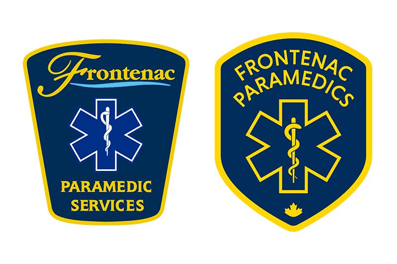
Volebregt introduced the new Frontenac Paramedic Services brand, which consists mainly of the crest that adorns ambulances and the uniforms that the paramedics wear. She said the entire focus of the branding exercise was on the role that paramedics play as medical professionals and first responders in the healthcare system.
Interviews were conducted with a total of 35 Frontenac paramedics. After these interviews, the decision was taken to radically alter the mission statement, even the name that is associated with the service. In place of language in the previous mission statement which talks about “meeting and exceeding objective and measurable standards” the focus is now on the very personal relationship between a paramedic and a patient: “We bring outstanding medical care to help people in our community and make a difference in their lives.”
The resulting changes in the brand are less radical than those of both Fairmount Home and Frontenac County, however the subtle differences reflect the dominant theme of the new brand, that Frontenac Paramedics are the in the helping business at a time when people are often in the midst of the worst day of their lives, that they are the medical system, and not just a means of transport to the medical system.
The new logo incorporates the Star of Life and the Rod Asclepius, medical symbols that were at the centre of the old crest. The word ‘Frontenac’, in the crest, now uses the new sans serif font that is used in the other Frontenac brands. The shape of the crest has been changed, and a maple leaf logo has been inserted at the bottom, again to be consistent with the other Frontenac brands. Finally instead of saying Frontenac Paramedic Services, it says Frontenac Paramedics. The final change is the most important one, it identifies paramedics as professionals who help people, instead of just members of a faceless service organisation.
The new brand has already been introduced. It will be incorporated on the uniforms as they are replaced and on the doors of Frontenac ambulances in short order.
The public will not likely notice a difference in branding, but the target of the exercise has been more the paramedics themselves than the public.
More Stories
- No Winner Yet in Catch The Ace But Fundraising Target Met
- South Frontenac Food Bank Opens Second Location in Battersea
- Sharbot Lake Pentecostal Church Anniversary - 1925-2025
- Frontenac Holistic Health Fair - September 20 At Storrington Centre
- Odd Year For Real Estate - But Sales Are Steady Year Over Year
- 193rd Kingston Fall Fair
- Kim Phuc - the Napalm Girl - To Visit Flinton In November
- South Frontenac Council - September 2
- Sticker Shock - EV Charging Station To Cost North Frontenac Township
- 30th Anniversary Verona Car Show
